What stays the same
The new design touches only the website. The endpoint, the request and response fields, your API tokens, your balance and your request history are the same, and every page kept its address. Your integrations need no changes.
A live request on the home page
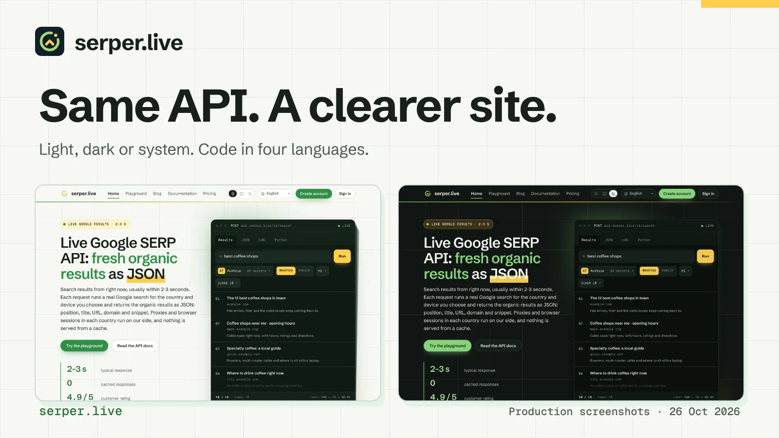
The first screen shows a request the way your code sends it: a window with POST api.serper.live/v1/search, the query, the market and the device. Its tabs show the same search as a list of results, as the JSON response, as a cURL command and as Python code, and the status line shows the response code and the time.
Below it, the markets are grouped by region, with a search field. Each row shows the code, the country and the price per 1,000 requests.
Prices and a cost calculator
The pricing page has the same list of markets and a calculator: set the number of searches a month with the slider or type it in, choose the depth from the top 10 to the top 100, and it shows the monthly cost, the searches per day and the top-up that covers it. For 100,000 searches a month or more on one market, a separate block explains how to agree individual terms.
Code in four languages
Every API example in the documentation and in blog posts comes in curl, JavaScript, Python and PHP, highlighted as in a code editor, with a copy button. The PHP examples need no libraries: a stream context and json_encode are enough.
The MCP section of the documentation has setup tabs for Claude Code, Claude Desktop and Cursor, VS Code and Codex.
Light, dark or system theme
The switch in the header offers a light theme, a dark theme or the theme of your system, and the site remembers your choice. The light theme is warm paper with a blueprint grid; both themes use green and yellow accents, and code blocks stay dark in both.
Text is set in Schibsted Grotesk, on Ukrainian pages in Onest, and code in Geist Mono. The fonts load from serper.live itself, and each page loads only the styles it needs.
The account, on a phone and in five languages
The account pages, from API tokens and balance to request history with stored results, use the same layout. On a phone the menu opens as a side drawer, and every page fits the screen.
The site, the documentation and the blog are available in English, German, French, Turkish and Ukrainian, and the language switch keeps you on the same page.
Take a look
Open the home page in both themes, run a search in the playground without an account, or find your market on the pricing page. Feedback on the new design is welcome through the contact page.